

It’s what you’ve all been waiting for! No, it’s not the John Lewis Christmas advert or an end of year bonus at work. It’s the Pantone Colour of the Year.
We haven’t always been favourable of the Pantone Colour of the Year. Ultra Violet didn’t take off and, at the time, 2015’s Marsala didn’t tickle our taste buds (funnily, now we don’t mind it so much). There have been some hits though. 2016’s Pantone pairing of Serenity and Rose Quartz and 2017’s Greenery could be seen within fashion and interiors and are even palettes which are still on trend today. And 2019’s Living Coral, although divisive, was a zingy and refreshing welcome to the Pantone alumni. So is the announcement of Pantone’s latest star hue going to be making waves? Meet Classic Blue…

Announced last week, Classic Blue is set to instil “calm, confidence, and connection” and apparently, at the dawn of a new era, it “highlights our desire for a dependable and stable foundation”. Other words are of course bounced around like resilience, enduring, elegant and restful. It’s apparently an honest and trustful colour. It’s blue.
Interestingly, Pantone has always picked a shade of blue at the turn of a new decade. In 2000, Cerulean and in 2010 Turquoise. And it’s not that it’s a bad colour. It’s actually a very versatile colour which could span a whole host of interior designs. But, for us, it doesn’t quite evoke the positivity that Pantone perhaps wants it to. Instead, it feels like a slightly lacklustre shade which doesn’t pack a punch and say “hello new decade full of trying times, take this”. It just sort of says “remember me? I’m the same blue that you’ve seen a million times and feel no real feelings towards”.
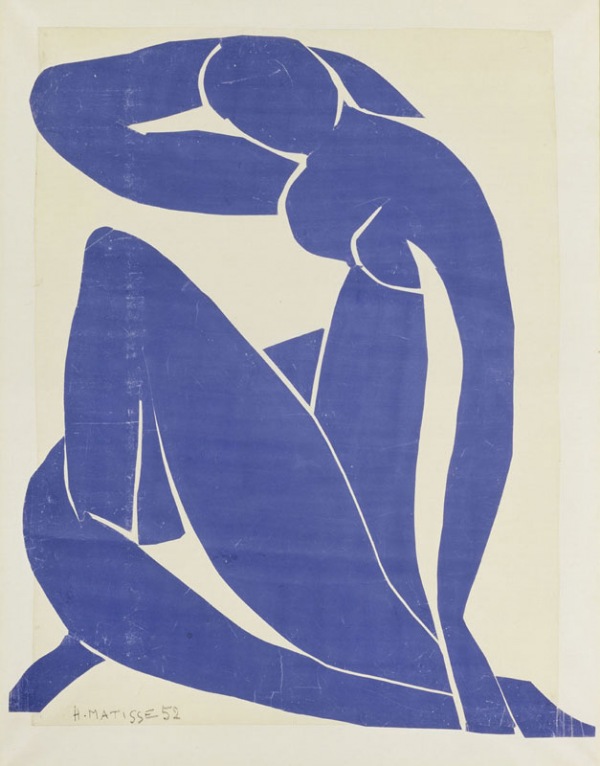
Classic Blue is the colour of dusk, preppy rugby sweaters and murky seas. It’s the colour of those carrier bags you get from a corner store, Pepsi cans, Matisse nudes and Joni Mitchell’s ‘Blue’ album cover. It’s also the colour of the Democratic party – perhaps Pantone (an American company) giving a middle finger to Trump? But let’s not read too much into it – because it’s just blue.
If Pantone wanted to look for a colour to give us reassurance in trying times then perhaps a ‘classic’ hue, implying tradition and timelessness, was not quite the right choice. And as we deck the halls and prepare to welcome in a new decade, is Classic Blue the right shade to kick of 2020? The jury’s out on that one.
What we do know is that like any Pantone Colour of the Year, or any brand’s Colour of the Year for that matter, it shouldn’t be taken too seriously. It’s just a colour at the end of the day. So don’t be too blue.
David & Mark x
